

A popular new feature in version 17.6 is the ability to post data in a shapefile or spreadsheet with an orientation attribute using Display GIS.
Typically, an arrow is used as the symbol to show this orientation and additional attributes can be displayed by varying the arrow length or colouring it with a gradient. This is ideal for workflows like stress mapping.
Spreadsheets remain a common way of storing well information for production data, key reservoir parameters, etc. and Petrosys has long supported the display of bubble maps and pie charts. It can sometimes be useful to map whether a parameter is present or not, or whether it falls within a certain range. Examples include:
- Dry hole analysis maps – presence of charge, trap, reservoir, seal
- Unconventional risking – total organic content, hydrogen index, porosity, etc.
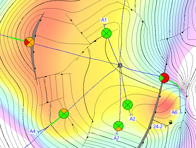
- Display reservoir key performance indicators
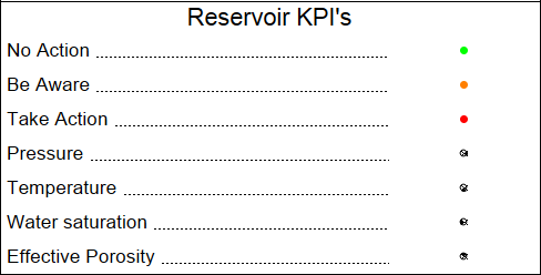
One interesting use of this functionality is to display a traffic light system – green “no action”; amber “caution”; red “take action” – for key performance indicators. In the example below, 4 KPIs for the producing sand are measured and posted on the map at the sand top location.
The workflow used to produce the above map was as follows:
- Custom well symbols can be created in Petrosys as CGM files and can easily be edited so that the number of segments matches the required number of parameters. Here, a custom symbol was created for one quadrant.

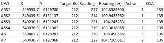
- The input data comes from a spreadsheet. In the example below there is a “Target Reading” and a daily “Reading” updated automatically from another worksheet. The “Reading (%)” shows variance from the target and a conditional formula based on this percentage in the “Action” column sets a value (1, 2 or 3 corresponding to green, amber or red). The “Q1A” is the angle used to plot the symbol above – in this case it will form the southerly quarter of the circle. The advantage of using the spreadsheet is that when the “Reading” column is subsequently updated, the final map will automatically update with no further editing required.
- The next stage is to display the data using the Display GIS option. Our custom well symbol (the filled quarter circle) is selected for the Point style in the Shape tab. In the Thematic mapping tab choose the new Style option called Symbol Style. Orientation is switched on and we use the column “Q1A” to set the rotation.
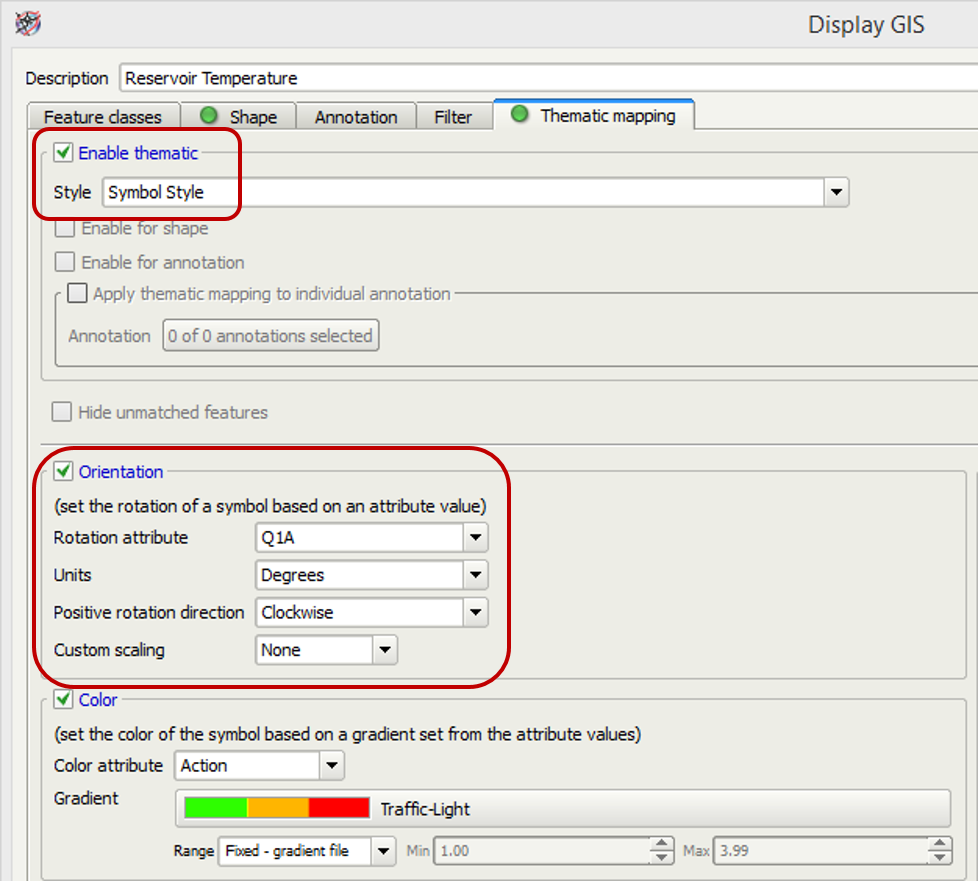 Custom colour gradients are also easily created in Petrosys. The new “Traffic-light” gradient makes sure that the quadrants will be coloured properly. Clients can create their own custom well symbols and gradients, or can ask for help from our support team.
 - The final stage is to copy and paste the display list item and update it for each of the other parameters. This simply requires changing the description, choosing the next parameter from the spreadsheet and updating the Rotation attribute.
- Adding a legend makes it clear to all consumers as to what the map is showing.
These maps are relatively easy to set up but we’re always happy to help if you need to create any custom well symbols or gradients, or if you need a recommendation for a suitable format for input data. In a spreadsheet with hundreds of rows it can be difficult to identify potential problems. Mapping the data makes it much easier to visualise and take corrective action before difficulties occur. As the spreadsheet controls the map, no further editing work is required in the map itself.
Plotting the maps can be done as part of an automated workflow and outputs such as layered PDFs make it easy to share the information with colleagues.
Contact support@petrosys.com.au if you want to know more.
For a complete list of features in version 17.6 browse our detailed release notes.