
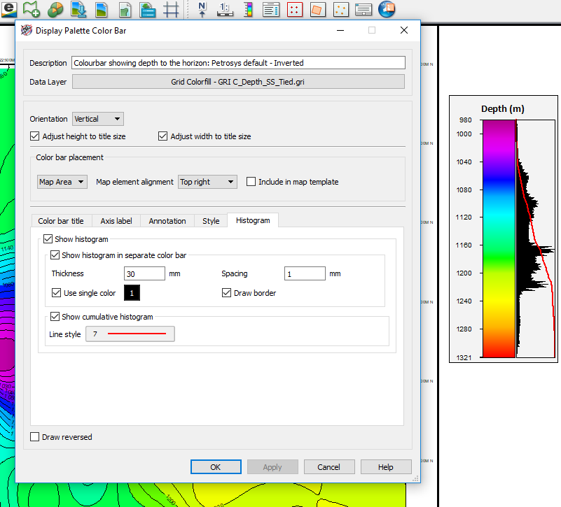
The latest release of Petrosys PRO 2018.2 introduces the ability to display data histograms associated to color bars. Once a grid or surface is displayed with its associated color bar, the option to display a data histogram can be accessed from a new tab that has been added to color bar panel.
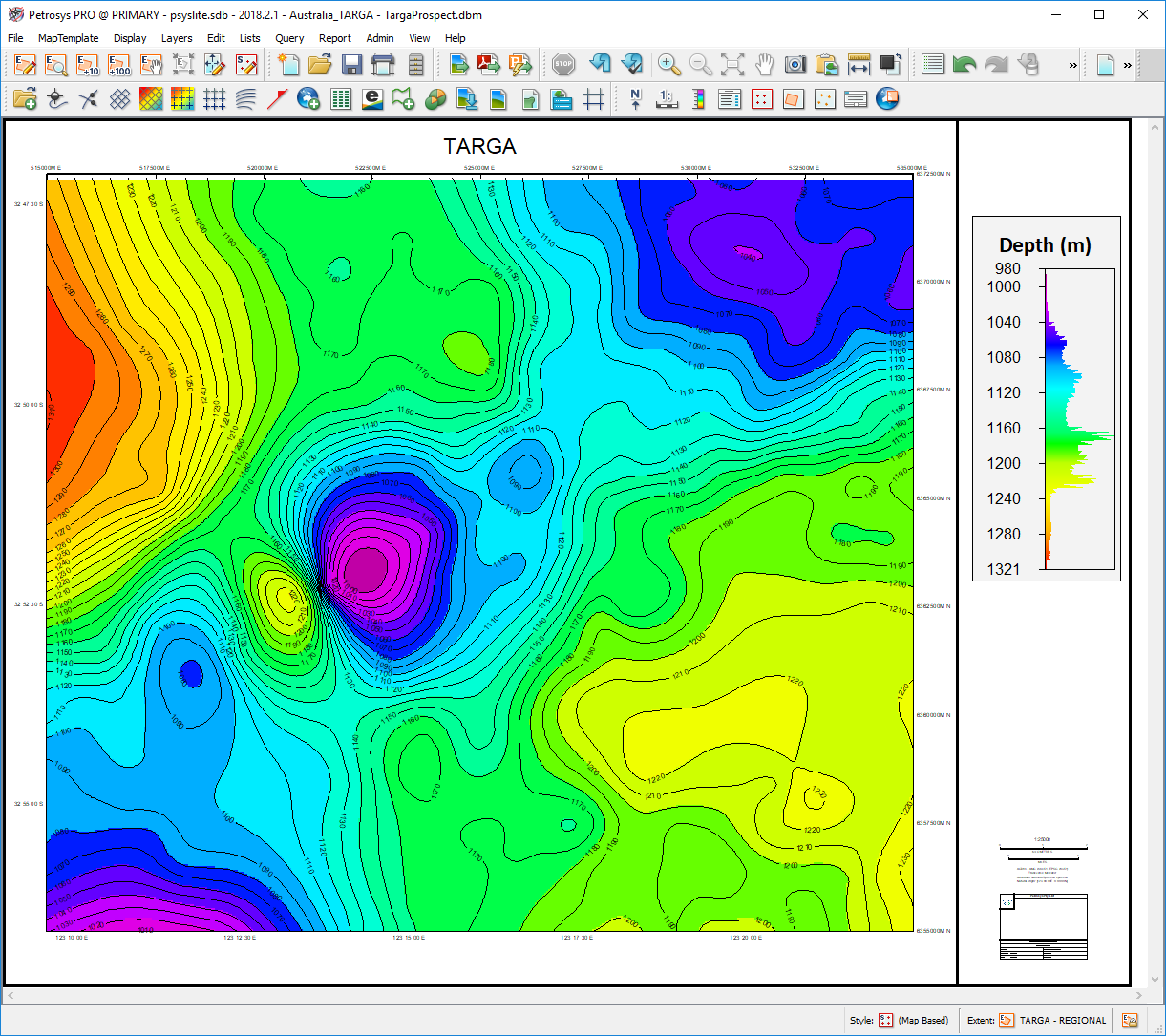
Displaying a data histogram will help users to visualize the data distribution and to better understand how the grid or surface varies spatially. As an example, it might help to pick spikes or extreme data variations which may not be obvious with a linear color bar. This is very useful when working with attribute data with an extreme Z-range, or with data where subtle color variations are hidden by a data spike. It can also help to identify where the spike is.
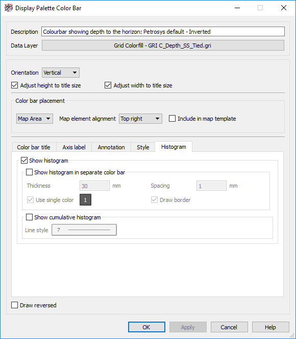
This new functionality allows users to display the histogram over the relevant color bar or as a separate one it. If the histogram is displayed as a separate element, then the users has the option to apply the color gradient or to use a single color.
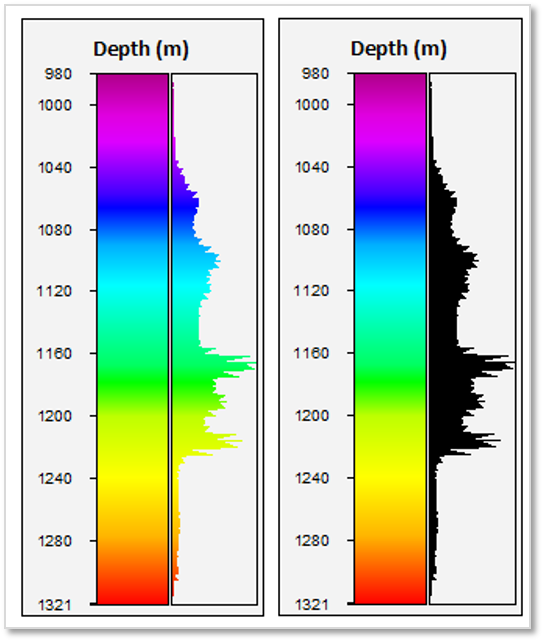
Also, users can choose to display a cumulative histogram line over the histogram.
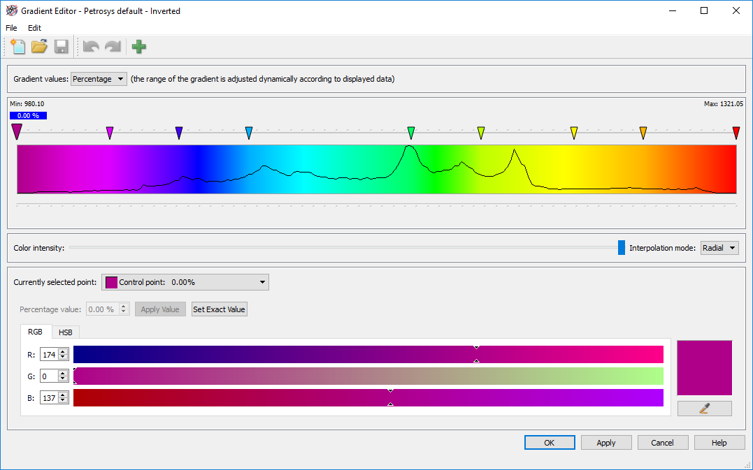
Another way to visualise the data histogram is through the Gradient Editor being applied to the relevant grid. To being able to have the data distribution in this panel can be useful when setting control points for a gradient to highlight features in a grid or surface.