
Working in the Oil and Gas industry for Petrosys, I’m already familiar with surface modelling of 2D and 3D data, however we’re not the only sector interested in the subsurface. The scale and complexity of worldwide infrastructure projects amazes me. Here in the UK, parts of Crossrail will open late this year. Crossrail is a major new east/west railway line across greater London, much of it underground, and work began in 2009.
While reading an engineering magazine article, I came across the image below. And skipped over it as it confused me. The image shows a “utility corridor” beneath one of the major stations and gives an idea of what challenges the designers and engineers face – avoiding all the existing tunnels and services installed over the last few centuries. The image was produced using Business Information Modelling (BIM) and I’m sure if I was one of the engineers working on the project, then the different colours and line widths would all be familiar and it would be obvious what it shows. But I’m not. It looks like coloured spaghetti to me and I don’t even know if the new railway line itself is shown. So, there’s nothing wrong with the image, but it isn’t intended for laymen like me.
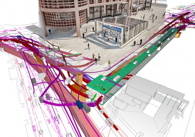
Image courtesy of Crossrail Ltd. [image 1]
A bit more searching and I came across another 3D image, but this one really shows two 2D images, stacked above each other. Much easier to get a feel for where the new tracks are and how they relate to other metro lines and the surface above them. A lot of the clutter has gone.
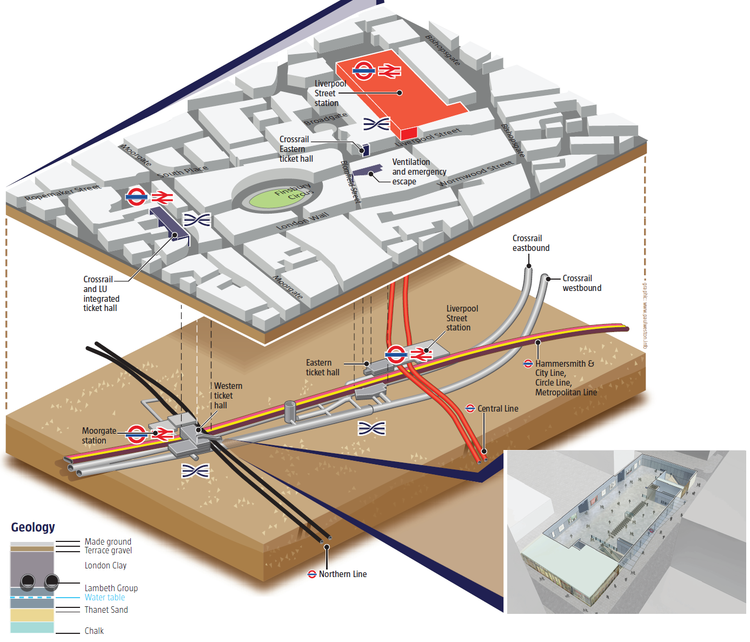
Image courtesy of Crossrail Ltd. [image 2]
When presenting this sort of information to non-technical managers and investors, or in this case the public, it helps to simplify things further into a map.
Crossrail has an excellent web-map where you can zoom in along the route and see exactly where the new lines are in relation to the familiar streetscape of London.
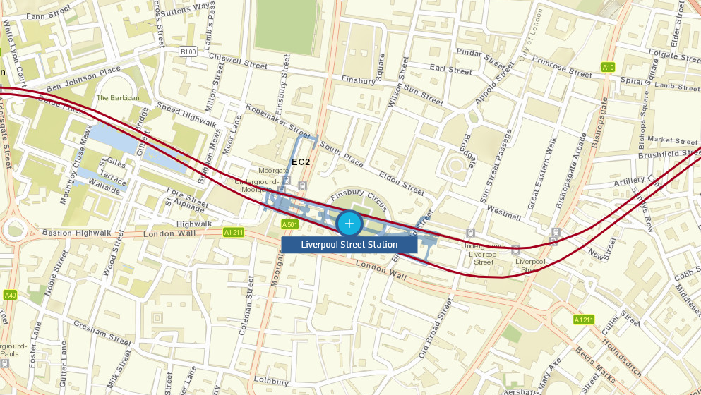
http://www.crossrail.co.uk/route/near-you/ [Image 3]
This in turn will be simplified into a schematic map showing just that key information that the travelling public need to know i.e. where the stations are and how where they can connect with other parts of London’s transport network.
![]()
Image courtesy of Transport for London [image 4]
If you’re still reading, you might be asking “what has this to do with subsurface modelling and mapping in the oil and gas business?” My conclusion is that both 3D and 2D modelling are essential for quality interpretation and effectively presenting results.
3D modelling benefits from the massive amount of data available as computing performance makes it easy to create and build 3D models; to immerse ourselves in the data and get a truly holistic view of the geology we’re dealing with. If I spend 6 months interpreting a prospect or building a structural model in 3D, then I’m going to be totally familiar with how the surfaces relate to each other; the faulting; fluid contacts and rock properties. Creating maps and sections throughout the modelling process helps with QC, as flattening a structure can highlight problems that may be hidden in the complexity of the 3D model. They provide snapshots of the process and form a valuable record of the project workflow.
Sooner or later I’m going to need to explain my model to my exploration manager, peers, or maybe investors. They may not have a lot of time and will require the result to be presented clearly so that they can make quick and valid decisions. Maps are all around us and universally understood. To simplify complex models and clearly communicate key information they are ideal – a good map will give managers confidence in their decisions, and in your work.
While Petrosys has a 3D viewer for QC’ing our surfaces, the core strength of our software is mapping. By connecting directly to live data in other systems, it’s easy to produce beautiful and informative maps throughout the E&P process without wasting time on exports and revisions.
Ewan Rule, Sales Geoscientist, Petrosys Europe