

When a map is to be used as the backdrop to marketing material, such as the cover of an annual report or the canvas of a convention poster; or when a key point on a map is to be the focal point of an insert in a graphical montage such as in a PowerPoint pitch; you may want to reach for the services of a graphics designer to add some graphical punch to highlight your message.
Having a graphics designer redraw contours and well locations – let alone seismic lines or surfaces – is a time-consuming process that has a high risk of publishing a highly magnified version of a mistyped value, the wrong well status, or a misplaced fault edge. Providing them with cartographically correct Petrosys PRO map layers makes their life easier and gives you more confidence in the accuracy of the final result.
At Petrosys we have a strong history of exporting maps into publishing tools for use in brochures, posters, and as backdrops to our trade show booths. Many of the improvements that have been made to the display styles and rendering functionality in Petrosys PRO have been inspired by these often very demanding and occasionally left of center requirements.

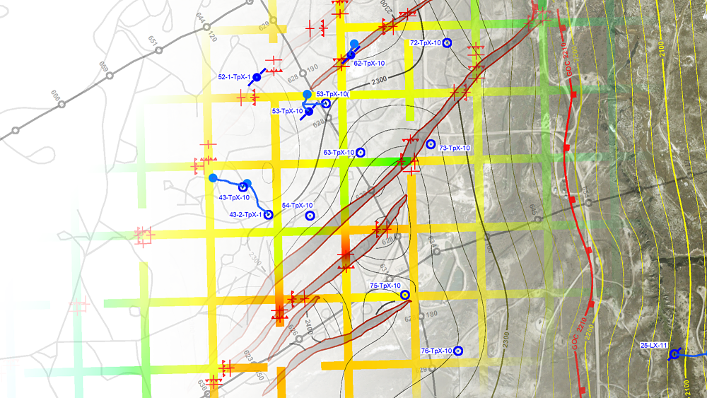
The original Petrosys PRO map, published to PDF, contains a combination of layers that is more complex than you’d normally try to publish as a stand alone map.
The introduction of layered PDF’s provided a dramatic improvement in your ability to present a graphics designer with a consistent high-resolution source from which they can extract individual layers of content into the creative tool of their choice.
When you use File/Export-PDF, just remember to group and name the layers in a logical manner; to set the paper size to the map size; and to set the DPI to a high value such as 150, 300 or 600. The DPI is the number of pixels that will be used for each inch of output on the paper size of your map, so if you’ve picked 150 and your map is 20” across your graphics designer will be getting 3,000 pixels across the map area. In general, you should provide at least 2,000 pixels across for most applications, and your designer will be really happy if you can give them 5,000 pixels or more if they are creating some large graphic. The tradeoff is that PDF creation will slow down, and the output files will get bigger.
The DPI is extremely important for satellite imagery and very important for grid color fill displays. There are additional options in the associated Display/- control panels of the map that impact the final resolution of published color fill grids and satellite images.
The quality of text in PDF’s will usually be excellent, provided that you aren’t stuck in the dark ages of Simplex fonts. However, you should avoid exotic fonts as these can have unexpected character substitutions if your designer’s toolbox does not include them.
The quality of lines, such as contours and boundaries, will be superbly smooth irrespective of the DPI used for a PDF. If you run into problems with the thickness of the lines in your graphics machine, then you may want to try switching the line width in the display option between ‘Scaled’ and ‘Absolute’ modes. The ‘Absolute’ mode will try to match a specific line width more accurately in publishing formats such as PDF.
The layers of the map are imported as individual layers into Photoshop, where creative application of transparency separates them across the page whilst also creating selected areas with little detail as backdrops for further content.
Next to PDF’s, raster images are now the most common form of graphics file used in graphic designing output using Petrosys PRO. The PNG format, which compresses images without creating shadowy artefacts, should be used. PNG’s are great for creation of output that is going to be at about the scaling of the original map view. However, all of the text and lines in a PNG have been down-sampled to the resolution (DPI) of the PNG file, so unlike in a PDF, zooming in to text and lines on PNG files will result in lower quality output.
A lot of users find our ‘Direct Output to PowerPoint’ a highly productive way of getting maps into graphics. When using this tool, just remember that the instant option under the menu bar only gives you an image at screen resolution. To get higher quality lines in PowerPoint, without going via an additional graphics file, use the File/Export-to-PowerPoint option and select one of the higher image resolutions. Your boss will appreciate the few extra keystrokes that deliver a much more impressive presentation.
Finally, Petrosys PRO can also deliver its graphics in vector file formats such as CGM. In the Oil and Gas industry CGM is primarily used as an intermediate graphics format for printing, and not all of its rich functionality is correctly supported by more general graphics design tools.

Finally, the graphics designer can add whatever additional content is required … in this case a prototype for our booth at the forthcoming AAPG in San Antonio. Hope to see you there!
We love to see Petrosys PRO maps being used in public and are keen on helping you achieve the best results when you do so. If this article has inspired you to aim for the next level in creative mapping feel free to contact our support team should you need help with the concepts outlined above – or if you have some suggestions for cool alternatives.